
Back to gallery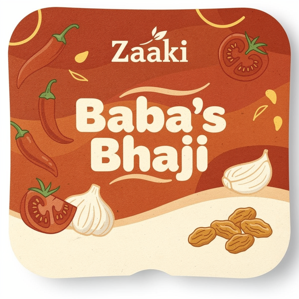
Create a **high-resolution, print-ready square label design (3.4 inch x 3.4 inch, 300 DPI)** for a premium hummus brand called **Zaaki**. The design should feel **bold, vibrant, playful, and modern with a Gen Z-friendly food brand aesthetic**, while still looking clean and retail-ready. --- ### 🧱 **LAYOUT STRUCTURE (TOP → BOTTOM)** **1. TOP SECTION (LOGO AREA)** * Place the **Zaaki logo centered at the top**, in **white** * Logo should be **small to medium size (about 10–15% of label height)** — not dominant * Keep it crisp, flat, no distortion, no shadows --- **2. FLAVOR NAME (PRIMARY FOCUS)** * Directly below the logo, place the flavor name: **“Baba’s Bhaji”** (correct spelling exactly like this) * Make this the **largest text element on the label** * Use **bold, rounded, friendly sans-serif typography** * Color: **warm white or cream** for high contrast * Slight curvature or organic baseline is okay for a playful feel --- **3. BACKGROUND DESIGN** * Use a **rich red-orange gradient background** (burnt orange → tomato red tones) * Add a **soft flowing “wave” transition** into a **creamy off-white bottom section** * Include **playful illustrated ingredients floating around the top/middle area**, such as: * Red chili peppers * Tomato slices * Garlic cloves * Golden raisins * Illustrations should be: * **Flat, slightly textured, hand-drawn style** * Playful but not cluttered * Integrated into the background (not stickers) --- **4. TAGLINE (FUN + EXPRESSIVE)** * Place below the flavor name: **“Tad Spicy. Tomato-forward. Cozy in every bite.”** * Style: * Slightly **script-like or casual handwritten font** * Color: deep red or clay tone * Add a **subtle curved underline or swoosh** * Should feel **playful and inviting, not corporate** --- **5. INGREDIENT SECTION (BOTTOM AREA)** * Add a section header: **“INGREDIENTS”** (small caps, centered, spaced out) * Below, list ingredients cleanly in **2–3 lines**: CHICKPEAS • TOMATOES • GOLDEN RAISINS • TAHINI • OLIVE OIL • LEMON JUICE • CHILIS • GARLIC • SALT • BROWN SUGAR • CITRIC ACID • SPICES * Typography: * Small, clean sans-serif * Color: dark brown or muted red * Use dot separators (•) --- **6. WEBSITE** * At the very bottom, centered: **zaakieats.com** * Make slightly larger than ingredients text * Clean sans-serif, spaced out, highly legible --- ### 🎨 **COLOR PALETTE** * Burnt orange / tomato red (primary) * Cream / off-white (base) * Deep red / clay (accents) * Warm yellow highlights * Subtle green ONLY if needed in ingredients (very minimal) --- ### ✨ **STYLE NOTES** * Lighting: **bright, clean, studio-quality** * Texture: **light grain for warmth but not heavy** * Avoid: * Overly realistic photography * Mediterranean tile patterns * Ornamental borders or clichés * Overcrowding * Overall vibe: * **Bold, modern, playful** * **Food-forward and craveable** * **Premium but approachable** * **Designed to stand out on shelf** --- ### 📦 **OUTPUT REQUIREMENTS** * Square format (1:1 ratio) * 300 DPI * Print-ready * Clean edges with slight rounded corner framing to mimic container lid
March 23, 2026·black-forest-labs/flux-2-pro
Ready to build your website?
Get your site up in about a minute.