
Back to gallery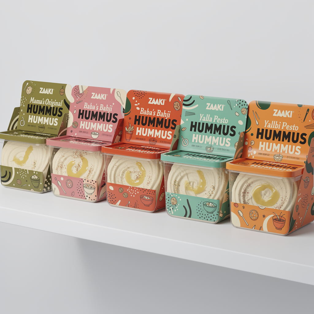
Create a retail-ready hummus packaging mockup for Zaaki that merges two distinct design approaches into one cohesive system: (1) the playful pattern language and layout structure of a patterned, illustration-forward design (2) the clarity and shelf impact of single bold hero colors per flavor. Use a square, transparent plastic container with a square lid, suitable for U.S. grocery stores. The hummus inside should be clearly visible and appetizing. Color system: Each flavor is defined by ONE dominant background color covering most of the lid and front label Colors must come from the Zaaki palette only: Mama’s Original → Olive green #A7A838 Baba’s Bahji → Rose pink #F37C90 or Harissa orange #EC6542 Yalla Pesto → Mint/teal #60C3AD Habibi Heat → Harissa orange #EC6542 Secondary colors may appear only as small accents within patterns or typography, never competing with the hero color Pattern & layout direction (from the second design): Use playful, graphic patterns and repeated illustration elements (abstract food shapes, oil drips, spice marks, simple icons) Patterns should feel bold, modern, and intentional, not decorative or traditional Layout should feel structured and consistent across flavors: same placement for logo, flavor name, and “HUMMUS” Brand elements: Use the Zaaki logo exactly as provided, bold and high-contrast The word “HUMMUS” must be clearly visible on the front panel, paired with the flavor name Typography should be oversized, confident, and Gen Z–friendly Avoid: Muted or washed-out color palettes Overly delicate illustrations Mediterranean tiles, ornamental borders, or cultural clichés Photorealistic ingredient collages FDA realism: Include believable U.S. grocery labeling elements (net weight, ingredients, allergen statement, nutrition facts panel on side/back). These should feel authentic and professionally placed. Overall vibe: Bold, colorful, and playful Systematic and recognizable as a lineup Gen Z–appealing and shelf-stopping Palestinian in attitude and confidence, not decoration Lighting should be clean and bright. The final image should show multiple flavors side by side, clearly demonstrating the single-color system and shared pattern language across the lineup.
January 30, 2026·black-forest-labs/flux-2-pro
Ready to build your website?
Get your site up in about a minute.